Hi, friends! I’m popping in between regular Friday posts to ask y’all for more guidance.

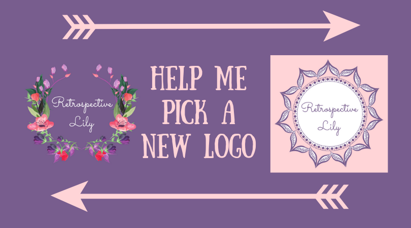
Last week, I shared a few logos I made to replace my current one. Below I am pasting my current one on the left and the logo that earned the most votes on the right.

In this post, I am presenting four options: two designs, two color schemes for each (+ one bonus design). Before you cast votes, I’d like to share some information and some concerns.

There are two qualities about my old logo that I’d like to preserve in the new one

  • It’s easy to read.
  • Its cute/sweet vibe pairs well with my general aesthetic/editing style.

Sidenote: light pink and medium purple are my brand colors.

Flower Wreath Logos

The flower logo is lovely and got a lot of praise. I chose the design because my name is Lily.

I realized that the writing was hard to read in the first version, so I enlarged the wreath to increase the font size and replaced the purple ink with dark grey ink. I felt concerned that the logo evokes an elegant/sophisticated vibe, whereas my style is more spunky, so I made another version with colors switched around. I like the version with inverted colors because it feels more “me.”

Let me know–does the elegant look of the flower wreath clash with my spunky style? Does the one with a purple background look more spunky?

Mandala Logos

The mandala logo earned a few votes. I like this design because it is reminiscent of both the sun and a flower. The implications seem fitting since my name is Lily, and I try to inspire people to be joyful and like to think of myself as a light in the world. I also think the design reflects my spunky aesthetic.

My concern is that mandalas are technically an eastern religious symbol. True mandalas are incredibly intricate, and this design strays very far from a traditional mandala, but I still want to know–would you think “religious symbol” if you saw this (had I not just put the idea in your head)? I’m throwing in a normal sun design in case you all like it.

Thanks for reading! I eagerly await your votes and suggestions. 🙂

P.S. If I haven’t read your blog in a couple weeks, don’t think I’ve forgotten about you; I’m slowly but surely making my rounds. Look out for a new “Blogging Tips & Tricks” on Friday!

Another P.S. Here are some images I’ve made since purchasing Canva for Work. If you like these, follow me on Instagram, and I’ll follow back. ♥
46 responses to “Help Me Pick a New Logo”

  1. No, I wouldn’t think of “religious symbol” from the mandala:)

    I really like the purple background for the flower wreath logo. They are all pretty, though.

    Liked by 2 people

    1. Thank you for your input, dear!

      Liked by 1 person

  2. I like the spunky purple! But both are awesome!

    Liked by 2 people

    1. Thanks for your input, hun!

      Liked by 1 person

  3. Light pink is softer-the darker purple logos are modern but both can represent your spunky self!🤗

    Liked by 1 person

    1. Thanks for your input, Mrs. Mama Duck! 🙂

      Liked by 1 person

      1. I’m a fan of your blog and your writing! Can’t wait to see what you choose.

        Liked by 1 person

  4. Decisions decisions… I’d be hard pressed to pick a favourite! But with the mandala style ones, no, I wouldn’t associate them with religious symbols. For those three styles I’d go for the first on the left (pink background). With the flowers, I think the purple background is more ‘spunky’, but I feel like the font needs to be thicker/more bold to read a little more easily when you first glance at it. Not sure I’m of any help and I’ve probably made things worse! Hahah I do love your designs though 🙂
    Caz xx

    Liked by 1 person

    1. No, your input was totally helpful! Thank you, Caz! ♥

      Liked by 1 person

  5. I like the purple background flower wreath!

    Liked by 1 person

    1. Thank you for your input, dear!

      Like

  6. I like them all!! I do think the purple is more spunky than the pink 🙂
    At first glance I can see how the one looks a bit mandela-ish but upon closer inspection it does not appear to actually BE one, to me anyway. Regardless, I’m impressed that you are concerned about making that correlation and that you have been transparent about that and are asking for advice. Kudos to you for being sensitive to the leading of God in all matters!
    Having said that: Tough call.
    I think the question is: is a Mandela-ish logo a Romans 14 matter? If so, does that mean it is perfectly acceptable in private but might offend someone of lesser faith in public? Hmm. I have no clue!!!
    The best advice I ever heard (about tough decisions): PRAY! and if you still don’t know the answer-pray until you do!

    Liked by 1 person

    1. Thanks for your words of wisdom, Salt! I’ve realized that when I make the logo smaller (my logo in practical use is way smaller than the ones in this post), it looks nothing like a mandala, so that’s a relief. I definitely don’t want to convey a confused or lukewarm message, so I had to ask my readers and God. 🙂 I didn’t get a bad feeling about the mandala or feel a strong pull one way or the other, so I reckon God doesn’t care much about which logo I choose. 😉

      Liked by 1 person

      1. So true–after prayer it sure seems some of the things I was fussing over don’t seem to be a big deal to Him 🙂 have a good weekend Lily!❤️

        Like

  7. Purple background.:)

    Liked by 1 person

    1. Thanks for your input, dear!

      Liked by 1 person

  8. Carolyn Joyner Avatar
    Carolyn Joyner

    Love the purple background with flowers – It is vibrant just like you!

    Liked by 1 person

    1. Thank you for your input, Carolyn!

      Like

  9. I didn’t think religious when I looked at any of them. I like the color schemes but think the purple background would reflect spunky more.

    Liked by 1 person

    1. Thanks for your input, Matt!

      Liked by 1 person

  10. I think they all look great! The ‘mandala’ designs still edge it for me. I feel logos should generally be simple (so they can be reproduced from very small to very large and still look good. With the flower designs, they are beautiful, but quite complex and I would worry a little that they are too detailed and intricate for a logo. Of course, most people access the internet on mobile phones these days so you want something that looks good on small devices.

    It’s challenging that the word ‘retrospective’ is long and ‘Lily’ is relatively short — I do dabble in design work myself so I realise the challenge this presents! 😂

    I honestly think they all look great (including the flower designs) and are an improvement on your previous logo. Looking forward to seeing what you decide!

    Liked by 1 person

    1. Steven, you’re a genius as usual, and that very issue is what threw my decision! The flower wreath becomes a mess when I shrink it. You’re right–simple is better!

      Liked by 1 person

  11. In love with the purple background 🙂 , well done these logo’s are brilliant 🙂

    Liked by 1 person

    1. Thank you, dear! ♥

      Like

  12. PennyTheBean Avatar
    PennyTheBean

    My fave is the purple flower wreath logo! It’s beautiful!!! 😍🌟
    Great job on designing these, btw. They look awesome!! 👌👍😍

    Liked by 1 person

    1. Thanks for your input and your kind words, Miss Bean! 🙂 ♥

      Liked by 1 person

  13. I like them all, flowers and mandalas. But the leftmost mandala is my favourite. I like the way the detail on the leaves stands out.

    Liked by 1 person

    1. Thank you for your input, Lee!

      Liked by 1 person

  14. Mahalia McGee Avatar
    Mahalia McGee

    Not sure my first vote transmitted. Purple background with flower wreath which is bright and cheerful just like you!

    Liked by 1 person

    1. Thanks for your input, Grandma!

      Like

  15. I do love me some mandalas, but personally, I do like the first choice of flower wreaths 🌸
    They are all so pretty, though!

    Liked by 1 person

    1. Thanks for your input and your kind words, Shae!

      Liked by 1 person

  16. Beautiful designs! I vote flower wreath, purple background with white font. Flowers tie in with your name, and easiest to read quickly/at a glance.

    The Mandalas lost the flower effect for me as pretty as they were and just looked like a pattern. I like the name tie in with flowers. (They all look good though, so you can’t go wrong!)

    Liked by 1 person

    1. Thank you for your input, Sullivan!

      Liked by 1 person

      1. Did you pick one? Or is that the next post?

        Like

  17. I like the 3rd sun, the one on the far right – definitely. Blessings, Lily!

    Liked by 1 person

    1. Thanks, Cindy! Blessings to you! ♥

      Liked by 1 person

  18. I prefer the flower wreath– i like the pink one, but the purple background is a bit more spunky and sassy!

    Liked by 1 person

    1. Thanks for your input, Mom!

      Like

  19. The purple background with the flower wreath makes me think vintage, youthful, happy, artistic – all things I associate with you, Lily. 😊

    Liked by 1 person

    1. Aww, thank you, Meredith! ♥

      Liked by 1 person

  20. My Favourite is the pink wreath one. 💕 but they are all great

    Like

  21. I favor the ones with more purple, but I tend to lean toward purple more than pink. I also like the headband shape of flowers. Food for thought: do you think you should incorporate more pink or purple in your logo? Do you lean more toward love, femininity, and tranquility in your posts or spirituality, reflection, and self-awareness? I hope this helps!

    Like

  22. ConfusedGirlTales Avatar
    ConfusedGirlTales

    I loved the 4th one

    Liked by 1 person

  23. I liked them all but flowers seem more springy and for year round purposes I say 4th or 5th. Whichever color you like best 🙂

    Like

  24. Love the wreath but I see what you mean, it may not fit your blog. I would not have thought eastern religion with the others if you had not said it, it reminds me of a flower. I am behind on this post, so I think I see a winner 🙂 and I think it totally fits!

    Like

Leave a comment

LATEST