Hi, friends. This post corrects a mistake/something I left out in an old post, Prezi Next vs. Prezi Classic. It’s kind of a game changer for the aesthetics of a Prezi presentation.
What Is Prezi?
Prezi is a digital presentation platform equivalent to Powerpoint that’s accessible from all locations like Google Docs. The slides in a Powerpoint move chronologically, but Prezi presentations are drawn on a blank canvas and consequently move in any order you choose. One that moves chaotically around the screen is so distracting (speaking from experience as a student). You usually want to use one of two patterns: a chronological line (in order left to right) or a “bubble map” with the first slide in the middle and the other slides branching off it. A presentation you might use the bubble map pattern with is “My 5 Favorite Poems by Robert Frost” because each poem can branch off from an intro slide about Robert Frost. In Linear vs. Non-Linear Presentations, I noted that Powerpoint presentations look more professional on a big screen than Prezi presentations because Prezi slides are circular while Powerpoint slides are rectangular…therefore, a Powerpoint slide simply consumes the screen, whereas a Prezi slide doesn’t use the four corners. So, if you were using a chronological pattern (aka 95% of presentations), I recommended sticking to Powerpoint vs. Prezi.
What I Missed
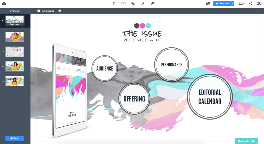
With Prezi Classic, every slide was shaped like a circle. Hence, here is how the presentation looked as a whole followed by what a slide looked like (ignore the “Press Esc to Exit” box):

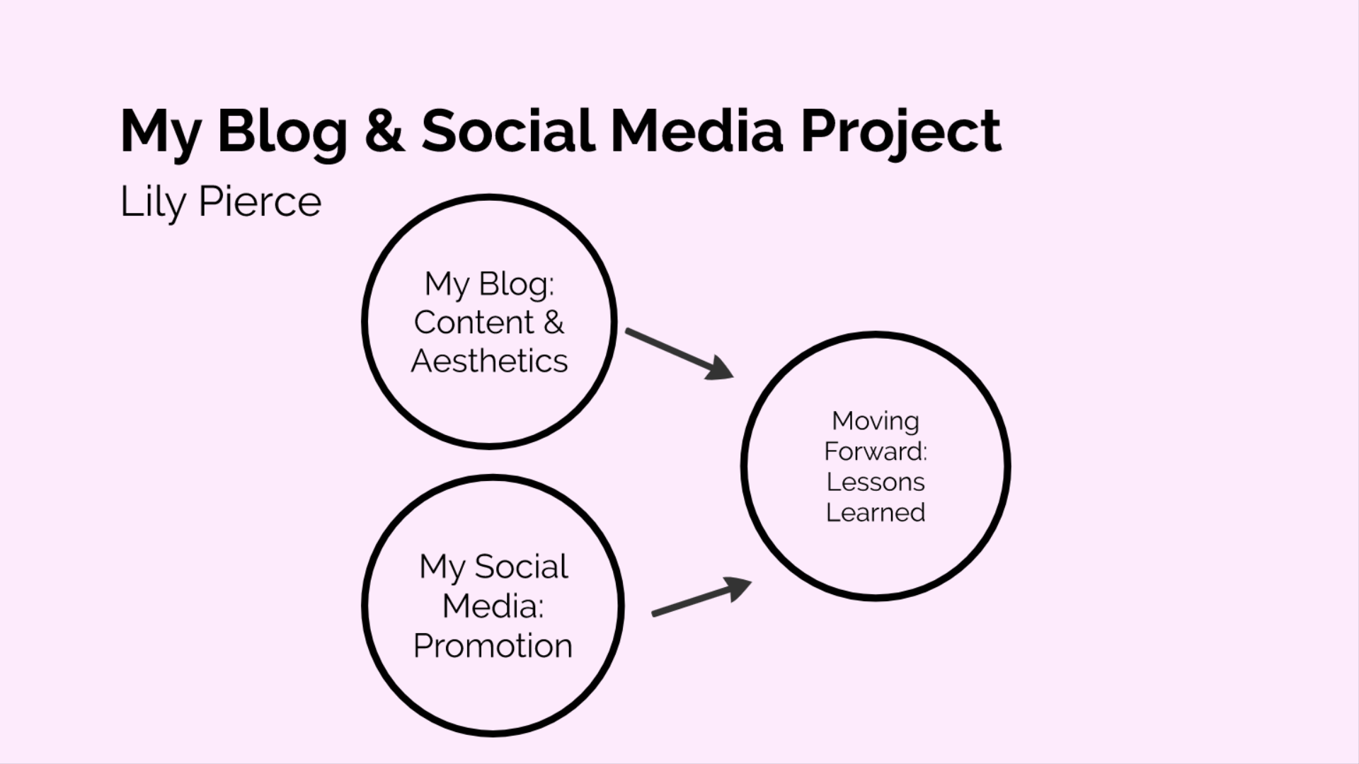
With Prezi Next, the presentation as a whole is still presented in bubbles. However, with Prezi Next, you can choose whether the slides are circular (the old way) OR rectangular (like a Powerpoint slide). Here is how the presentation looks as a whole followed by how a slides looks if you make it square:

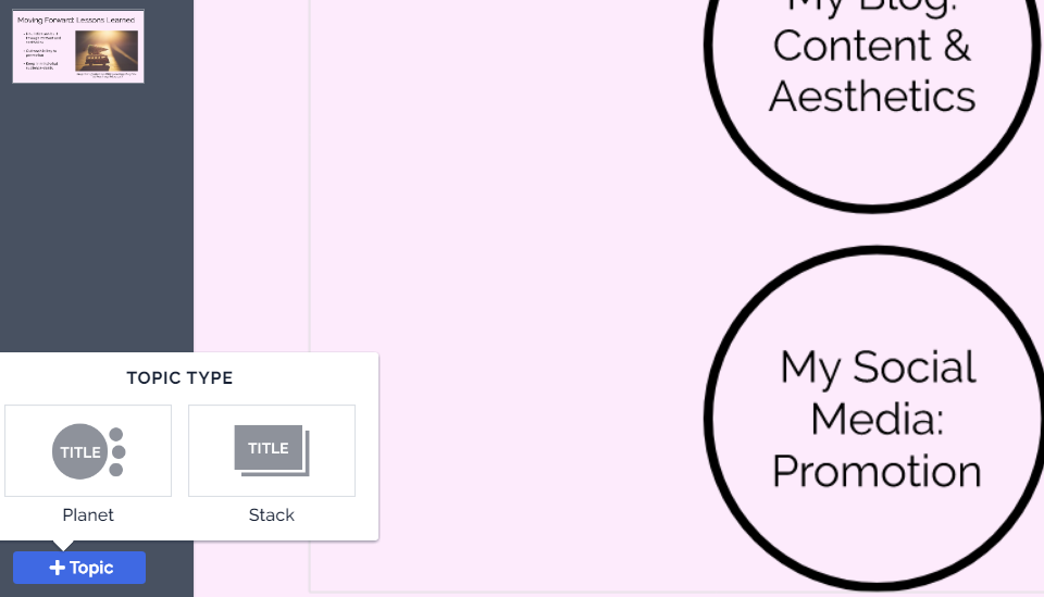
I didn’t notice this upgrade until I experimented with the options that appear in the bottom left-hand corner each time you add a new slide (topic) now. “Planet” is circular; “stack” is rectangular:
Final Thoughts
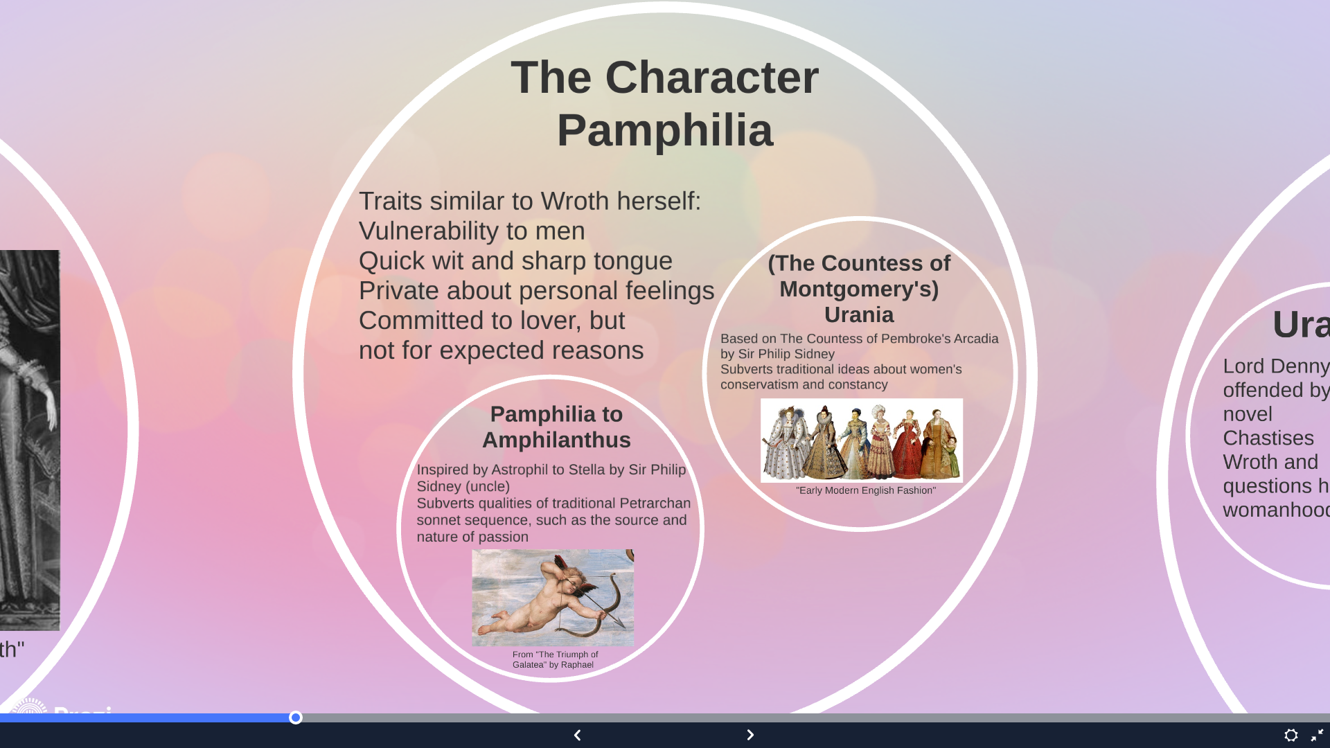
I still prefer the simplicity of Powerpoint (or Google Slides) for linear presentations, but this aesthetic option makes Prezi presentations look cleaner overall. [In what I call a linear presentation, the info or argument/thought process moves A to B to C to D. My first example presentation (Lady Mary Wroth) was linear, though it contained zoom-ins that are also possible on Powerpoint. My second example presentation (My Blog & Social Media Project) is not linear, and I arranged the bubbles/topics/slides to represent how my blog and social media experiences worked together to result in my final reflections.]


Leave a comment